Popular

IP

This is default featured slide 1 title

Go to Blogger edit html and find these sentences.Now replace these sentences with your own descriptions.

This is default featured slide 2 title

Go to Blogger edit html and find these sentences.Now replace these sentences with your own descriptions.

This is default featured slide 3 title

Go to Blogger edit html and find these sentences.Now replace these sentences with your own descriptions.

This is default featured slide 4 title

Go to Blogger edit html and find these sentences.Now replace these sentences with your own descriptions.

This is default featured slide 5 title

Go to Blogger edit html and find these sentences.Now replace these sentences with your own descriptions.

video

Showing posts with label Review. Show all posts

Wednesday, June 6, 2012

Review: Panasonic Eluga

The Panasonic Eluga is the first smartphone to arrive since the Japanese electronics manufacturer announced its plans to shift over 1.5 million handsets by the end of March 2013, following its re-entry to the European market.
Originally unveiled at the company's European conference in Hamburg in February, and then formally introduced at Mobile World Congress the following month, the Panasonic Eluga dl1 is available from online retailers for around £380 SIM-free in the UK (and $700 SIM-free on Amazon.com in the US, although it isn't listed on the Panasonic US site).
This pitches the company's comeback handset against the likes of the Sony Xperia S and the Motorola Razr - two mobile phones that also boast the same sized display as the Panasonic Eluga at 4.3 inches.

And, for a 4.3-inch smartphone, the Panasonic Eluga is tiny. It's not quite as slim as the 7.1mm Motorola Razr but, with a girth of 7.8mm, it has the same waistline as the HTC One S.
But, because it is around 7mm shorter and narrower, and its extra sharp curved edges bring its lowest thickness measurement down to around 3mm, it appears even slimmer than those competitors at first glance. And it's easily the lightest 4.3-inch-screen mobile phone that we've come across too, at a slender 103g.

One of the key features that Panasonic is keen to push is the Panasonic Eluga's water and dust-proof skills.
It has nabbed itself an IP57 certificate, which means that it can handle a dip into water (up to 1m and for up to 30 minutes) and that dust can't enter in a large enough quantity, thanks to the gaskets and O-rings, to cause it any bother.
We didn't go the whole hog of taking it snorkelling for half an hour, but we did leave it in the sink, under a running tap, and it didn't seem to cause it any problems.

On the top of the Panasonic Eluga are its only moving parts - two flaps that make way for a micro USB port and micro SIM insertion - and these seemed to keep the water out without issue.
You may have already gathered from the lack of a third flap that there's no microSD option on board - a real shame when you consider that built-in storage is a rather underwhelming 8GB.
The display, as mentioned, is a 4.3-inch one with a 960 x 540 qHD resolution, which puts it on a par with the likes of the HTC One S and the Motorola Razr, but it's not quite up to the 1280 x 720 standards that Sony set with the Xperia S.
It's an AMOLED display, which offers vibrant colours and great viewing angles, if somewhat muffled in crispness, thanks to a touch of over-saturation.

The Panasonic Eluga's matt black or silver finish to its back means that it's comfortable to hold and won't suffer too much from smears and fingerprints.
The power and volume rocker button placement isn't ideal, though. They are easy enough to access if you're operating your smartphone southpaw-stylee, but try pushing them with your right hand and you're in for an uncomfortable experience.

The power button, especially, is a tricky little blighter. And we mean little. Sure, Panasonic's gunning for a slimline, minimalist beauty here - but would it really have hurt to make what is a very frequently used button (it also doubles as the sleep/wake one) a bit more accessible?

Also on the back is the Panasonic Eluga's 8-megapixel camera lens, sans-flash, sadly, along with a notification of its NFC capabilities, which we'll come back to later.

The front of the Panasonic Eluga keeps the sharp theme going - not just with the piano black 4.3-inch AMOLED display, but by almost seamlessly blending the screen with the thin bezel.
There's not really much room for anything else up front, save for the Android control buttons, a tiny Panasonic logo, a minuscule speaker grill and a titchy LED for notifications - and if that's one too many superlatives for small, we apologise, but the Panasonic Eluga's raison d'être is its minute attributes.
The Panasonic Eluga is running Android 2.3 Gingerbread for now, although a summer update to 4.0 Ice Cream Sandwich is promised. It runs via a TI OMAP 1GHz dual-core processor, which may have wowed us a bit more last year, before the quad-core revolution hit full wing.

Source: View the original article here

Sunday, June 3, 2012

Hands-on review: Leica M Monochrom

Although it is based on the Leica M9, the Leica M Monochrom has no colour filter array, so it can only record black and white images.
This means that every one of its 18 million pixels is used to record brightness values, and there is no demosaicing of the red, green and blue signals to create a full colour image.
Removing the RGGB (red, green, green, blue) filter array above the sensor has a number of effects. Firstly, more light can reach the sensor, which is good news for noise control because the signal requires less amplification, which is prone to introducing noise.
The fact that more light reaches the Leica M Monochrom sensor means that it is effectively more sensitive than the Leica M9's sensor, so the base sensitivity setting is higher.

Consequently, the Leica M Monochrom's native sensitivity range runs from ISO 320 to ISO 10,000, but there's also a low-end extension setting of ISO 160. In comparison, the Leica M9's native sensitivity runs from ISO 160 to ISO 2,500, and there's an expansion setting of ISO 80.
Traditionally, Leica cameras are favoured by reportage and street photographers, and these users often need to use middle to high sensitivity settings, so the Leica M Monochrom's higher base setting is likely to be good news for them. Those who need to use very fast shutter speeds or shoot with a wide aperture can resort to shooting with an ND filter over the lens.

Like the Leica M9, the Leica M Monochrom has a 2.5-inch monitor with 230,000 pixels. This is disappointing enough in a camera that has a retail price that's just a shade under £5,000 or $7,000, but it in a camera that retails for around £6,000 in the UK or $8,000 in the US, it is staggering.
Reviewing images on the screen of a pre-production sample Leica M Monochrom revealed that the screen isn't as detailed or as sharp as that of a mid-range DSLR that costs a fraction of the price.

One difference between a Leica rangefinder and a DSLR or compact system camera (CSC), however, is that the screen is only ever used to review images. There is no live view system.
Accordingly, images are composed in the Leica M Monochrom's optical viewfinder. As in the Leica M9, this provides a larger field of view than the mounted lens (down to 28mm), and it displays the most basic exposure information in large red LEDs.

Naturally, focusing is manual only and uses a rangefinder system whereby the lens ring is rotated until the floating image lines up with the one visible through the viewfinder. This takes some care and practice.
Leica's M-series cameras have a build quality that is second to none. It's not really news then that the Leica M Monochrom has a wonderfully solid feel, it is constructed from a single piece of magnesium alloy with a textured leather coating and brass top and bottom plates. It is a thing of beauty.

Although its body is large in comparison with the current crop of mirrorless compact system cameras, it's important to remember that the Leica M Monochrom houses a full-frame sensor and it is considerably smaller than the full-frame DSLRs that are currently on the market.
Although the LCD screen isn't the most detailed, it is useful for checking exposure, since the shadow and highlight warnings can be set to operate at levels that suit the photographer. The warnings are shown in red, which stand out well against the monochrome image.

Like the Leica M9, the Leica M Monochrom has none of the exotic modes found on the average digital camera - it is intended for use by a photographic purest who wants to concentrate on the key aspects of exposure and composition.
Nevertheless, it is possible to select one of three tones (Sepia, Cold and Selenium), which can be applied to JPEG images as they are recorded. There are also a number of filter options that emulate the effect of using optical filters on black and white film photography.
As yet we have only been able to inspect the results from a pre-production sample of the Leica M Monochrom, but they are very impressive. Noise appears to be very limited, and even in the shadows shots taken at ISO 2500 have only a fine grain visible at 100 per cent on the computer screen. Tonal gradations also look natural and smooth.
We spoke to Leica Akademie tutor Brett (he doesn't use his last name) who used the Leica M Monochrom with the new Leica APO-Summicron-M 50mm f/2 ASPH lens (£5,400/$7,195) for a couple of days. He told us that although he is very impressed with the camera, it will take a little while before he learns how to get the absolute best from the DNG format raw files.

Because he has found that the Leica M Monochrom records a lot of detail in shadows and noise isn't a major issue, he recommends that images are exposed for the highlights.
He's also a fan of the new Summicron 50mm lens, but warns that it is so sharp that it emphasises the drop-off in focus, which is quick, so it's absolutely essential to get the focus spot-on, especially when shooting wide open.

Clearly with a retail price of around £6,000 in the UK or $8,000 in the US, the Leica M Monochrom isn't going to sell in huge numbers, but from the reaction to its launch it is obvious that it holds huge appeal to the Leica faithful. It seems to sum up both the history and the future of Leica as a great photographic brand.
It's about getting the best black and white photo possible, and this means gathering the maximum amount of luminance data in-camera. It comes with Adobe Lightroom and Nik Silver Efex Pro 2, recognising that in the modern age some adjustment is often necessary to get the desired look.

Results may look good straight out of the camera, but there is usually room for improvement. Traditional black and white photographers shoot to produce a negative that has all the information required to create a print, and dodging and burning are just part of the process. It's just the same with digital photography.
While the Leica M Monochrom can produce JPEGs for that instant result, the DNG raw files have the most data for manipulation.

It's early days yet, and we have yet to test a full production sample, but the Leica M Monochrom looks like it could be the ultimate camera for shooting black and white images.
We anticipate that many well-heeled and professional Leica users will invest, keeping their existing Leica M9 or Leica M9-P for colour work while the Leica M Monochrom is reserved for black and white shooting. Nice.

Source: View the original article here

Alienware X51

Dell's gaming-centric Alienware brand has gone down the console form factor route with its Alienware X51 PCs. The erstwhile X51 though has recently had a little open-heart surgery to give it a new Ivy Bridge beat to its processor rhythm.
The X51 is about the same size as the original Xbox 360 and is obviously angling this machine deliberately as some sort of simpler gaming machine compared to the normal desktop giants. That said it does have the look of an angular corporate chassis from the HR department of some Men in Black-style organisation rather than a 1337 gaming box.
But this is being targeted as a gaming machine, capable of delivering "an immersive HD gaming experience so you can meet any challenge", so says the Alienware concession housed in the Dell website. While it's certainly capable of reasonable HD gaming performance, I think it's going to struggle to meet any challenge. And the 'graphics for greatness' tag is rather overselling the meek little Nvidia GTX 555 graphics card humming away inside the cramped chassis.
Having said that though, you have to admire Alienware for sticking to its desktop guns. It would have been easy to try to knock out a small form factor desktop machine using notebook parts, a la the nettop. The much-maligned nettop.
So it's with pleasure that we see the meek little GTX 555 is a proper desktop variant, with dual-slot cooling and a proper PCIe 6-pin power connector. While it's no gaming powerhouse in graphical terms - with 288 CUDA cores and a 192-bit memory bus it's not going to be setting the world alight with flying polygons - it's still way ahead of a lot of the mid-range notebook graphics around. In fact this OEM only card seems to be almost identical to the GTX 560 SE that was released by a few add-in board (AIB) partners in the spring.
The version we've reviewed has got the original Intel Core i7 2600 inside, but for the same price Alienware has replaced that chip with the new Core i7 3770. As you'll know from our Ivy Bridge coverage there's not a lot between the two chips in performance terms, certainly not in gaming performance with a discrete GPU.
So what actually is going on inside the X51? Well, it's a rather smartly designed and well-engineered machine, managing to squeeze all the necessary desktop components into a diminutive form factor.
The motherboard Alienware is using inside is a tiny H61, with a pair of DIMM slots and one x16 PCIe 2.0 connection. In order to maintain the clean, pseudo-corporate lines the graphics card is connected via a PCIe riser board, which allows the card to be mounted parallel to the main motherboard.
To be honest, the engineering around the graphics card is the most impressive thing about the X51 and the fact that it is relatively simple to remove and replace has to be applauded. So long as you can find a graphics card of a similar sort of size to the OEM GTX 555 then you'll be able to find a home for it.
In fact, the GTX 670 fits inside nicely, and with the 150W TDP of the GTX 555 you could expect to be able to find the juice in the 300W PSU of the X51 to keep it juiced-up happily. There's even a spare 6-pin PCIe power connector inside the chassis just waiting for a more powerful graphics card to take its place inside.
In those twin DIMM slots lies two 4GB sticks of 1,600MHz DDR3, in dual channel configuration. A full 8GB of system memory is more than enough for any game you care to throw at it and, in fact, for most productivity tasks too.
The only really sad note is that, while it's laudable that Alienware is offering the Ivy Bridge i7 for the same price as the i7 2600, it's not changing the chipset it sits in. Alienware is using the self same H61 chipset for the Ivy Bridge CPUs as it does throughout the rest of its lineup. That makes sense for the build of the machine, keeping to the same layout, but it means you're losing some of the goodness of the new platform.
CPU rendering performance
Cinebench R11.5: Index score: Higher is better
ALIENWARE X51: 6.86
CHILLBLAST FUSION ROCKET: 7.12
CPU encoding performance
x264 v4.0: Frames per second: Higher is better
ALIENWARE X51: 36
CHILLBLAST FUSION ROCKET: 36
DirectX 11 tessellation performance
Heaven 2.5: Frames per second: Higher is better
ALIENWARE X51: 9.1
CHILLBLAST FUSION ROCKET: 15.6
DirectX 11 gaming performance
Metro 2033: Frames per second: Higher is better
ALIENWARE X51: 11
CHILLBLAST FUSION ROCKET: 22
DiRT 3: Frames per second: Higher is better
ALIENWARE X51: 40
CHILLBLAST FUSION ROCKET: 62
DirectX 10 gaming performan
Just Cause 2: Frames per second: Higher is better
ALIENWARE X51: 38
CHILLBLAST FUSION ROCKET: 39
Most notably the native USB 3.0 and PCIe 3.0 connectivity. The first isn't a massive loss as there are still two USB 3.0 sockets, though not native, sat on the rear of the H61 motherboard. The lack of PCIe 3.0 connectivity is somewhat more of a problem - maybe not now but moving forward with this machine it might be.
The actual design of the chassis is another concern. There's nothing really wrong with the build quality of it, and the way it has been designed to fit full desktop components into a small form factor is excellent, it's just that it feels so flimsy and plasticky. There's a lot of give in the surrounds of this machine, something that doesn't exactly scream £900 worth of quality.
In terms of raw performance you'd have to say the Alienware X51 is no behemoth of the gaming world. It's most definitely capable, but it's a bit of a stretch to see this as on par with any other £1,000 rig out there on the market. Granted prices of gaming machines have risen with the latest round of graphics card and CPU releases, but even the sub-£1,000 rigs we've tested since the Sandy Bridge launch have the edge in terms of performance metrics.
Indeed, if you look back 12 months we reviewed the Chillblast Fusion Rocket, a £750 Sandy Bridge machine with the excellent AMD HD 6950 as its graphics grunt. The Core i5 CPU came overclocked, which gave it CPU performance rather close to that you'll see from even the Ivy Bridge chip. Which you'll note isn't one of the 'K' series CPUs, and as such has the locked multiplier that these days means no overclocking allowed. With the geriatric-looking CPU cooler sat inside the X51 that's probably for the best though.
In games performance too the old Chillblast machine has the edge, posting double the Metro 2033 performance of this Alienware rig. The DirectX 10 performance of the Nvidia GTX 555 makes things much closer, but then you don't buy a new, gaming-branded machine for around a grand and hope that it'll cope with games a generation further back in time. You buy a £1,000 gaming PC to play the latest games and to play them well.
Sadly, even at 1,920 x 1,080, you know the Full HD that Alienware is talking about on its site is lacking with the GTX 555. So despite having serious desktop rig credentials - offering full access to the CPU, giving the option of upgrading the GPU at a later date - the Alienware X51 doesn't quite have it where it counts. The form factor may be pleasing, but you're certainly paying over the odds for the sort of gaming performance you'll see spat out at the end.
It's a shame that Dell isn't offering the machine as a barebones system for a decent price. Being able to drop in your own CPU and GPU combo would make this a far more appealing proposition. A low-powered Core i5 2500 with a tasty little GTX 670 would make for one serious gaming rig, and would make mincemeat out of this gaming also-ran.


Source: View the original article here

Sony Xperia U

The Sony Xperia U is the third of Sony's new wave of Android smartphones, using the same styling as the much larger Xperia S and the slightly larger Xperia P.
The Sony Xperia U is the smallest of the three handsets, offering a 3.5-inch TFT display inside the same angular, black case as the Xperia S and Xperia P, and an odd transparent plastic strip acting as part design feature, part information panel and part silly light-up novelty.
Prices are relatively modest for a modern smartphone that says "Sony" on it, with the Xperia U popping up for around £169 on Pay As You Go or £215 SIM-free in the UK, or $340 SIM-free in the US. But can you really get the style of the Xperia S on a budget?

It's pretty close. The Sony Xperia U is small and solid, offering much the same in balance and build quality as last year's excellent Sony Xperia Ray, with Sony putting three capacitive touch buttons beneath the display, indicated by tiny silvery dots.
There's an explanatory icon embedded in the transparent strip, telling Android newcomers these buttons are, from left to right, Back, Home and Menu.
The touch areas are big and very sensitive to presses, meaning it's easy to use the phone without thinking too much about your actions or having to aim your button stabs.
The smaller 3.5-inch display makes the Sony Xperia U fit the hand well, so one-handed use is possible with ease, too.
Above the screen sits the front-facing VGA camera, which can be toggled and selected within the camera app, producing low-res images that emerge from the camera at 640 x 480 resolution.
There's also a proximity sensor up here so the phone knows if you're holding it to your head and can dim the screen accordingly.
The sides are black with rather flimsy and plasticky buttons, with the 3.5mm headphone jack up top and the USB connector top left.
The right-hand side of the Sony Xperia U is where the party starts, because this edge houses the power button, which is nice and easy to find at the top right, along with the volume up/down rocker in the middle, then the camera button bottom-right.

The chunky power button's easy to find and the physical camera shutter button is always a useful thing to have, especially since the latter brings up the camera app when held down for a second or two, even when the phone's in standby.
The camera button is quite flat and well recessed into the Sony Xperia U's case, meaning you have to press it pretty hard to make it focus and register. We tended to end up using the on-screen button to take shots instead, because it's just easier.

And there's your big, exciting design feature - the strip lights up. In more than one colour. It's quite cool, especially when viewing photos in the gallery, because the Sony Xperia U detects the most prominent colour in the shot, then alters the colour of this strip accordingly.
It's hard to take a photo of. The strip's much brighter and more colourful to the human eye, more so in the dark.

And if you're even more colour obsessed, the black plastic beneath the see-through strip can be unclipped and replaced with something brighter. White. Or Pink. Or yellow. Which is great, if you're a child.

Removing the back is a rather hard and worrying experience. You have to press it down and push it up, which means squeezing the phone quite tight and putting a lot of pressure on the display.
We were quite worried we'd end up breaking the display from the pressure. But we didn't. We should probably stop worrying so much.

Inside the Sony Xperia U sits a full-size SIM card slot, although there's no SD support in here, so you're stuck with the relatively tight 4GB of accessible storage space Sony has put in here.
That's a bit of a shame, but at least the battery is replaceable, which will earn the Sony Xperia U some brownie points in this age of sealed, non-accessible phones.
All of this comes together to give the Sony Xperia U a quality, well-made feel, that does indeed ape the design of the high-end Sony Xperia S rather well.
It feels tough and durable, the display and buttons are sensitive, while the smaller 3.5-inch screen is bright and clear, so much so that it could be considered a worthy replacement for many bigger, more costly Android models.
Source : View the original article here

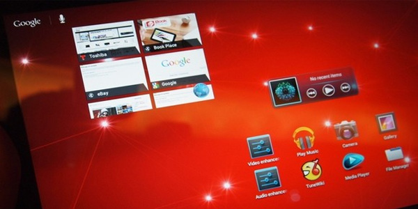
Hands-on review: Toshiba AT300

Premier partnerSamsung

Toshiba's latest 10.1-inch tablet is a fine attempt to undercut the new iPad – it comes in at £329 for the 16GB version and £379 for the 32GB variant.
The device will be known as the Toshiba Excite 10 in the US. Quite why Toshiba has decided to give the UK a lesson in boring branding is anybody's guess.
Tosh hasn't exactly set the world alight with its tablet offerings thus far, but the AT300 packs quad-core Nvidia Tegra 3 as well as Android 4.0 Ice Cream Sandwich. It's no slouch in terms of specs or when it's in use. The AT300 replaces the AT200 which featured a dual-core processor and Android 3.0 Honeycomb (the AT200 was also priced more expensively, too).
The biggest problem Android tablets have is standing out from the crowd and offering consumers a compelling reason why they shouldn't go and buy an iPad. Unfortunately the AT300 doesn't really give a truly compelling reason, but that price point competes effectively with the iPad 2.
It's nice and light at 590g, while the aluminium finish feels very nice in the hand. It's also pancake thickness at 8.95mm. The footprint is 261 x 179mm. The glossy 1,280 x 800 LED display is Gorilla Glass for extra strength. The display is crisp and bright, though pales in comparison to the new iPad or an OLED display.
As you'd expect there are two cameras – a 5MP one on the rear (with LED flash) and a 2MP on the front for video calling. The AT300 also features a full-size SD card slot so you can build on the internal storage of either 16GB or 32GB.
We're not dead keen on the edges of the device, but there's plenty to be pleased about, with micro HDMI and micro USB ports and single 3.5mm headphone jack/mic in addition to that SD slot. A 10 hour battery life is cited - we'll have to test this out properly when we get our AT300 review sample.
The Toshiba AT300 release date is June.


Source: View the original article here

Hands-on review: Samsung Chromebox

Premier partnerSamsung


Some may have suggested that the desktop is a dying breed – a relic of a bygone computing era – but Google is looking to buck that trend by putting its Chrome OS on a tiny computer called the Samsung Chromebox.
The small form-factor PC sports the latest version of Chrome OS and arrives alongside the new Samsung Series 5 Chromebook, to offer up a meaningful competitor to Apple's Mac OS and Windows PCs.
Priced at $329 (£279), the Samsung Chromebox is designed for the lower end of the market – think net-top – and its tiny size and simple interface could just make it a viable computer for people who value simplicity and surfing over file management and power.


The Chromebox ships without a monitor, keyboard and mouse but obviously needs all three – something worth considering if you do not already have the necessary accessories.

Saturday, June 2, 2012

Hands-on review: New Samsung Series 5 Chromebook

Premier partnerSamsung

It would have been understandable for the original Google Chromebooks to be written off as a failed novelty, a mid-price laptop divested of the huge ecosystem that you get with a Windows PC and without the wow-factor of Apple's Macbooks.
But this is Google we are talking about, and the search giant is desperate to show that it can do for the PC what its Android OS did for the phone. The criticisms of the original – some constructive, but some bordering on gleeful must have stung, but the second coming for Chrome OS is clearly a significant step forward
The original laptops, from Acer and Samsung, were nice pieces of gear – thin and portable although more expensive than a netbook and more limited in their functionality because of the operating system.

They also had a key problem with the touchpad – which was literally clunky; uncomfortable to use for long periods and not as responsive as Google or its early adopters would have liked.
But the real issue was Chrome OS itself. Designed around a browser, this was all about cloud connectivity, taking advantage of our increasingly connected world and the burgeoning market in browser apps to do away with our need for local storage, lengthy boot ups and security updates.
Unfortunately, this meant that when the laptop was without a connection it went from being a functional, quirky and well-priced offering to something of a white elephant. Offline use was simply not good enough and the lack of a desktop meant that multitasking was trickier than it should have been for a multi-function device.
The new Chromebook – complete with the latest Chrome OS – aims to address many of those issues and persuade people that the reasonable price of £379 ($592) – or £429 ($670) for the 3G version – for a laptop with 4GB ram, instant boot and a novel new approach is worth the risk of removing the safety net of Microsoft Windows.

Tuesday, May 29, 2012

Review: Western Digital My Book Thunderbolt Duo 4TB

Premier partnerSamsung
Beats FireWire 800 speedsCan daisy-chain other devicesImproved access to replace a disk
The My Book Thunderbolt Duo is Western Digital's first desktop drive to use an ultra-fast Thunderbolt interface. In fact, it has two such ports, so the drive and an external display can be connected to a Mac with just one by daisy-chaining the display from the drive.
There are two disks inside, and WD has improved the marking and releasing of the mechanism that lets you in, should a disk need replacing.
They're configured as a striped array by default, for the full capacity of 4TB in a single volume, with the risk that everything is lost if one disk expires. However, it has tremendous speed benefits. With files of 2MB and larger, it averaged 298.4MB/second when reading, and 266.1MB/second when writing, but with large variation in write speeds, between 353.1MB/second down to a low of 217.2MB/second.
Fortunately, the supplied software enables you to easily reconfigure the hard disks as a mirrored array, halving the usable capacity and slowing transfer rates, but with the insurance of having two copies of your data. In this mode, read speeds averaged 189.1MB/second, and 126.4MB when writing. We found less variation in write speed in this mode. It peaked at 176.8MB/second, and hit a low of 111.7MB/second with a 100MB file.
The Thunderbolt Duo delivers speeds in excess of the equivalent FireWire 800-equipped Studio II drive, and it can be bought for £400, which isn't a huge premium.
However, its performance is inconsistent compared to some other Thunderbolt RAID arrays, such as LaCie's Little Big Disk Thunderbolt Series 240GB SSD, which are a better option when sustained high speed is essential.

Monday, May 28, 2012

Review: Toshiba BDX5300

Smart TV services3D Blu-ray playbackDigital file supportLow priceBasic user interfaceHigh relative priceAwkward remote controlNo MKV playback
Ease of use increasingly makes or breaks electronic products, but with the Toshiba BDX5300 Blu-ray player, Toshiba is hoping there are shoppers out there who still put core features and a low price at the top of their wish lists.
With built-in Wi-Fi, smart TV services and support for 3D Blu-ray, you'd be forgiven for thinking that the Toshiba BDX5300 is the equal of its more expensive competitors.
All core, must-have features of the modern age are here - and for a price of £119 in the UK and $139.99 in the US. The Toshiba BDX5300 is all about getting ticks next to your shopping list, with Wi-Fi and 3D playback both deftly integrated.
The smart dimension is a bit more of a fudge, with a rather limited collection. Currently it's just a four-spiked service in the UK, with BBC iPlayer, YouTube, Acetrax and Picasa, while US customers get Netflix, VUDU, Hulu Plus, Pandora and YouTube.
Toshiba probably takes the view that these services = smart TV in most consumers' heads, so why bother complicating matters? It's a good call, since the Toshiba BDX5300 makes up in simplicity what it lacks in choice (or any semblance of a pleasant operating system, as we'll see).
Since the US version of the Toshiba BDX5300 boasts Netflix, it's a shame that the UK version has only Acetrax for movie streaming; all such media streaming services are in their first generation, and sadly lacking in must-watch titles, so it's wise to have access to as many as possible if you like your films streamed.
What you don't get on this so-called 'smart' Blu-ray player, which are found on most of the other mid-market decks, is a wide choice of internet widgets or apps, or any notion of an app store.
Nor is there a web browser, but since we often criticise such software we're can hardly bemoan their collective no-show. It that respect at least, less is certainly more. 
Anything DLNA-compliant - such as a PC, netbook or a Mac running Twonkymedia - is recognised by the Toshiba BDX5300 and included in its source list. There's also some digital file support from a docked USB stick, too, although we're not expecting wonders.
We do like the super-slim, compact (just 430 x 200 x 36mm) Toshiba BDX5300's design; a silver arrow stretches across the entire fascia, pointing downwards and nicely lightening an otherwise heavy gloss black appearance. For the money it's actually a remarkably attractive finish.
That slim 'Wide Chassis Aero Cosmetic' hull contains outputs for just HDMI and coaxial digital audio (optical would have been nice), with an Ethernet LAN slot nearby for more reliable, wired internet, and a USB slot up-front.
As well as playing purchased discs and BD-R and BD-ROM discs, the Toshiba BDX5300's pop-put disc tray also supports CD, CD-R/-RW, DVD, DVD+R/+RW, DVD-R, SVCD and VCD.
The Toshiba BDX5300 is one of six in Toshiba's Blu-ray line-up for 2012. Sitting above the 2D-only Toshiba BDX3300, which also sports smart TV functions, it's a notch or two above the Toshiba BDX1300 - a basic 2D deck with no smart functions. It's also above the smart-less, but 3D-ready Toshiba BDX4300. There's something for everyone, then.


Sunday, May 27, 2012

Review: Hands on: Unnecto Quattro review

Premier partnerSamsung
When we showed up at CTIA 2012, we had no idea what Unnecto was, but their folded phone brochures littered the show floor and media room, so we just had to find out what they were about.
For the most part, Unnecto sells cheap, unlocked GSM phones with their own Unnecto OS. However, they have two Android offerings, and the Quattro definitely has something to offer.

It's first trick is functionality as a dual-SIM phone - meaning taking calls on your work number and your home number can be done through the same phone.

It's got a five megapixel rear facing camera, a 4-inch LCD display (with a resolution of 480 x 800).

The 650Mhz processor isn't going to exactly tear through complex processes, but it didn't feel sluggish in our time with it.

The plastic back feels expectedly cheap, and it's obvious the design is one of the steeper corners cut. It has a large rectangular home button that looks remarkably Apple-esque.
It comes with a slightly tweaked version of Gingerbread and with the weak processor, we don't expect we'd much like Ice Cream Sandwich even if it was installed.

The Unnecto Quattro will be releasing in coming months and cost less than $200. The official line was "between $150 and $200," which sounds like an absolute bargain for the dual-sim wielding niche.

Review: Updated: Nikon D3200

Premier partnerSamsung

Excellent guide mode24MP sensorFull HD videoNo raw shooting in Guide modeOdd colours on LCD screen.
By all accounts, Nikon had a great year in 2011, topping both the DSLR and compact camera charts. The former came via the Nikon D3100, the company's entry-level offering with a 14.2 million pixel sensor, which is a great way in for those looking to get serious about their photography.
Nikon says that it will continue to market and sell the D3100, giving customers the choice between a budget model, and a more sophisticated option in the D3200.
There's lots of interesting technology crammed into the relatively small body of the Nikon D3200, including things that have trickled down from its more expensive bodies.
These include features such as the Expeed 3 processing engine, which promises to deliver quicker processing, low noise and a range of frame rates for Full HD video recording.
A number of other improvements have been made to the camera, which is priced at £649.99 in the UK and $699.95 in the US. These include slight ergonomic upgrades in the form of newly added buttons and an enhanced rear LCD screen.
But it is of course that 24.2 million pixel sensor that is likely to be the most headline-grabbing feature, coming just weeks after the unveiling of Nikon's other high resolution camera, the Nikon D800 (with 36 million pixels).
Coming from a company that used to profess that 12 million pixels was "enough", it's likely that some will scoff at the hike in pixel count, but Nikon is keen to point out the cropping potential that such a high resolution offers. This means that users who are unlikely to invest in a second, longer focal length range can crop into images post-capture and still retain a large enough pixel count for high quality images.
Aiming itself so squarely at the entry-level user, improvements made to the Guide Mode are something Nikon is understandably keen to shout about. On the Nikon D3200, new guides including Reds in Sunsets have been added, which - along with the original guides - is designed to help users to achieve the best possible image quality without necessarily having to have a huge amount of photographic knowledge.
Helpfully, the updated guide now has more reference images. These change as the settings are adjusted to show the typical impact.
Another feature that's likely to appeal to the intended target audience is the option to purchase an additional Wi-Fi adaptor, the WU-1A, which connects the camera to smartphones and tablets for remote shooting and uploading images to social networking sites.
A number of retouch options have been included in the camera, including the capability to straighten and crop images and add digital art filters after the shot has been taken.

Saturday, May 26, 2012

Review: Samsung Genio QWERTY

With a colourful chassis, full QWERTY keyboard and seriously budget price tag, the Samsung Genio QWERTY is squarely aimed at the younger social networker.
Available initially from Orange from under £70 on pre-pay, the Genio QWERTY is a very affordable alternative to BlackBerry-style message-centric devices.
It joins the low-cost touchscreen Genio Touch in Samsung's budget portfolio, with the Genio QWERTY leaving out the touch-and-swipe control interface and instead adopting a more conventional 2.2inch display and physical control system to wow its users.

It maintains the bright and colourful bodywork of the Genio Touch with swappable coloured back panels supplied in-box and others available as extras.
As well as emailing, texting and instant messaging capabilities, the Genio QWERTY is pitched at social network users.
The Orange-flavoured version we reviewed adds optimised online access to services via its Orange World portal, with links for services including Facebook, MySpace, Flickr, Picasa, Friendster and Photobucket.

There's no 3G to speed along online activity though (nor Wi-Fi, as you'd expect at this sort of price) – the Genio QWERTY is a quad-band GSM phone only, chomping through data at more modest GPRS/EDGE speeds.
The Samsung Genio QWERTY's onboard media capabilities include music and video player applications plus an FM radio – with a 3.5mm standard headphone jack so you can upgrade the supplied earphones.

Support for MicroSD card memory expansion is also included, and the Genio QWERTY's budget price tag is reflected in a modest 37MB of onboard storage.
The phone's camera snapping credentials are limited to a low-key 2MP camera on the back panel - but hey, you get what you pay for.
Design and handling
Samsung has trimmed costs with the display too. The 2.2-inch screen is a low-resolution (220x176 pixels) 65K-colour effort, rather than the sort of higher quality displays we've seen in recent Samsung devices.
That means graphics are a bit blockier and less refined, which is noticeable in graphic-rich applications such as web browsing and image viewing.
Like most BlackBerry-style devices, the display has a landscape orientation that's designed to be more messaging friendly on a wide-bodied device.
The Genio QWERTY's vital statistics – 110(h) x 59(w) x 12.9(d)mm and 94g – are slim and light enough to slip comfortably into a trouser pocket without questions over whether you're pleased to see people you meet.

The curvy plastic bodywork is reminiscent of several recent Samsungs including the Genio Touch, the Blade and the Jet.
Like the Genio Touch, its 'Fashion Jacket' back panel battery covers can be swapped. Included in our box were three such 'Jackets', in black, deep yellow and yellow with orange swirls, which work strikingly with the Genio QWERTY's glossy black with yellow and chrome trim front.

Side volume keys and the dedicated camera button on the side are splashed yellow, while the number keys on the QWERTY keyboard are also highlighted with yellow blocks, so you can quickly pick them out from the rest.
The 37-key QWERTY keypad isn't the most spacious we've encountered, although the four lines of keys are decently separated and contoured sufficiently.
This enabled accurate typing with one or two thumbs, and our large fingers didn't struggle too much in achieving reasonable typing speeds.

Among the QWERTY buttons are 'quick keys' for certain feature shortcuts, including new messages and the music player – although Samsung has also replicated some of these among its user interface shortcuts onscreen and via the navigation controls.
The control panel arrangement above the QWERTY keypad revolves around a typical navigation D-pad, which is nicely raised against the surface for quick and responsive thumb manipulation.
Immediately next to this are large softkey buttons, which initially feel oddly placed, as they're not adjacent to the relevant screen softkey options.
A bit of usage means you'll quickly get used it though. Call and End keys perch on either flank of the control panel, and again are pleasingly substantial.

Source:  View the original article here

Review: HTC Desire

HTC Desire

After unleashing the massively impressive HTC Legend, its bigger brother, the HTC Desire, is here - faster, bigger and more powerful and still packing the Android punch.
It might be the Nexus One rebadged, but this is a behemoth of a phone in its own right; has HTC tried to do too much?
Check out our HTC Desire video review:
We reviewed a Desire from T-Mobile, which is first in line to offer the phone on UK release, but we also checked out our findings from another Desire review unit straight from HTC, to really find out how it compared to the competition.
While the Legend was all about style and functionality in one tidy package - the HTC Desire takes a slightly different approach.
Instead of the gorgeous aluminium chassis, we're given a slightly more low-key brown case and a huge 3.7-inch OLED capacitive touchscreen.
Also read:15 best mobile phones in the world today
But while the screen certainly is massive, the phone itself doesn't seem gargantuan. The screen reaches the edge of the chassis nicely, and the four buttons on the front of the HTC Desire are almost flush and set in attractive aluminium.

If you're looking for comparisons between this and the Nexus One, the first is highly obvious: the trackball is gone.
HTC has given the phone the Terminator eye once more (head back to the HTC Legend review if you want to know why we're glad it doesn't glow red and threaten humanity) which is basically an optical trackpad that registers finger motion over the sensor.
The phone is very slim indeed, with dimensions of 119 x 60 x 11.9 mm, and weighs in at just 133g. If you're counting, that's 2g heavier than the iPhone 3G and the exact same weight as the iPhone 3GS - and that makes it very pocket friendly indeed.

It has a rubberised chassis, which is a little hard to grip at times. We're not talking so slippy you'll be dropping it all the time, but it still can be a little difficult to hold in one hand, especially if you have dinky digits.
That said it sits very nicely in the hand, with a sumptuous curved chassis feeling very nice and making it easy to press the buttons on the front with the thumb.
There's actually very little button-wise on the HTC Desire, with only six in all. The front four buttons are standard HTC Android fare (Home, Menu, Back and Search) and the Terminator optical trackpad also clicks in as an enter key.

The up/down button on the left-hand side of the phone is flush to the chassis, as is the power button on the top - which sits next to the 3.5mm headphone jack atop the HTC Desire.
The power button also functions as the lock key, and is very nicely placed to press whenever necessary (and trust us, we've seen some horrors; we're looking at you, Samsung Galaxy).
That's it button-wise, as there's no camera key (instead the HTC Desire uses the trackpad to take a snap or two) which is a little sad - we still love a dedicated shutter button.
The USB slot is hidden at the bottom - no cover to keep the dust out, but on the plus side it's once again microUSB, banishing the memory of the horrid miniUSB port from HTC designs of old.

There's also a microSD card slot for extra memory - but that's hidden below the battery, and can't be taken out without turning off the phone.

The screen is simply to die for - we mentioned it was an OLED capacitive effort earlier, but that brings such glorious colour reproduction and 3.7-inch is a great size for media and the internet on a phone.
It's a little tacky under the touch - the iPhone for instance feels a little smoother - but we're being very, very picky with that, as it registers the slightest touch with ease.

The design is sleek, and the Desire certainly looks the business - sleek and compact, while still showing off the power of the OLED screen. Yes, it lacks the style of the HTC Legend, but we think it more than makes up for that in function.
In the box
HTC is excellent at keeping packaging minimal, and the Desire once again comes in a coffin-like box with the standard kit inside.
This means a microUSB cable, which plugs into an adaptor to make a wall charger, and the standard headphones which double as a hands-free kit.

HTC hasn't seen fit to update these, but they're functional and work well to use for calls and media, providing you don't have the same odd-shaped ears as us.
There's not a lot more, but with the minimal space in packaging you can see why HTC has kept the components down. We would like to see some PC software on a CD or memory card, but it can be downloaded from the site with ease.

Source:  View the original article here

Friday, May 25, 2012

Review: LG Chocolate BL20

LG Chocolate BL20
LG has introduced a more sweetly priced slider phone – the Chocolate BL20 – to try and tempt style-savvy phone buyers not interested in the more feature packed (but higher-priced) Chocolate BL40.
Sporting a similarly sleek design, the LG Chocolate BL20 is the latest update of the original LG Chocolate phone (KG800) that first appeared in mid-2006.
Central to the chic look is a smooth, glossy piano-black casing that features hidden touch-sensitive controls on the front panel that glow red through the casing only when the phone is activated.

It's a more refined look than earlier Chocolates, echoing the BL40's design – although the Chocolate BL20 has fewer high-end features than its touchscreen range-mate.
The new Chocolate BL20 instead offers a more typically mid-priced mobile package – including HSDPA high-speed 3G data connectivity, a 5MP camera, media player functionality and an FM radio. But the real headline on this new phone from LG is certainly style.
Design
The minimalist bodywork of the closed Chocolate BL20 is certainly attractive. Its black bodywork is offset with metallic red trim on top and bottom and on the slide-down number pad, plus some subtle chrome edging.

Measuring 105.9(h) x 50.8(w) x 12.3(d) mm, it's a slimline slider that weighs a reasonable 115g and is nicely balanced in the hand.
However, all that glossy bodywork does mean it can be slippery in cold or damp conditions. Covered in a single plastic sheet, the front panel is also a finger-smudge magnet.
The display is a 2.4-inch QVGA (240 x 320 pixels), 262K-colour LCD, which is bright and zingy enough for most applications. It's not as big as a smartphone-style screen, but is acceptable for this type of mid-range device, especially with no touch control.

The original Chocolate phone was one of the first to introduce a touch sensitive navigation pad, and the BL20's similar digit-stroke control panel takes up most of the space under the screen.
A central select button surrounded by four direction arrows glows out from behind the black casing when the slider is opened or the phone activated, delightfully fading again when the phone goes into standby mode.
These buttons work conventionally to navigate around menus, albeit requiring light touching rather than pressing. They each also do typical phone shortcuts for calling up features, including text messaging, contacts, ringer profiles and a quick menu grid (you can select up to nine apps or functions for fast-touch access).

Other buttons include two regular softkeys, a button that shows active features as icons on a toolbar, and a widgets key.
This key pulls up five mini apps you can scroll between on screen, wherever you are in the menus. Functions include an alarm clock, memo writer, calendar, favourite contacts list and an online-based weather forecast app you can define for your preferred location.
A light finger glide is all you need to use the controls, like stroking a mobile phone version of a duckling. Dabbing around the menus is similarly effortless, although the sensitivity of the controls to even the merest of touches can cause accuracy issues if you're not handling it carefully.
A stray thumb or finger brushing the pad (generally your own) can accidentally activate a shortcut or the select button.
It's not particularly troublesome in most features but has potential for irritation in some, such as if you accidentally select send while composing a text.
LG has included touch activated volume/zoom controls around the BL20's side, plus a camera key and a screen lock button.

A single microUSB socket on the side takes care of charging, PC data connections and earphones; there's no standard 3.5mm headphone socket on the phone (boo), though an adaptor is provided in-box (slightly quieter boos).
The sprung slider mechanism revealing the number pad feels sufficiently robust. The pad itself provides large keys with plenty of finger room, and despite being flush against the surface are very responsive for fast, accurate texting. The metallic red finish is arresting too.

Source: View the original article here

Review: Acer Liquid S100

Fast processorSlim chassisVisual home screen bookmarksSpeedy internet browsingAwful battery lifeBuggy messaging systemConfusing contacts sortingConstantly crashing Android system.
Acer Liquid S100: Overview, design and feel
By bringing the fastest Android phone on the planet to market, Acer has good reason to be proud of the Liquid S100. Packing a Qualcomm Snapdragon processor and super hi-res screen, there's a lot to get excited about on this phone.
Acer might be a relative unknown in the mobile world, but that hasn't stopped it making an impression with first the Windows Mobile NeoTouch S200, and by bringing top-end specs and the Android OS, the Liquid S100 will be seen by some as even better.
But one constant problem with Acer phones from the past is that despite bringing some nice parts, they often fail to be anything more than average in general use. So can the Liquid change that?

The phone looks pretty basic out of the box, with a white plastic shell encasing a 3.5-inch screen, but with the large amount of plastic border around the display, it doesn't look anywhere near as big as the iPhone or Samsung H1.
The four touch-sensitive buttons at the bottom offer basic Android navigation, and the hieroglyph look is pretty neat.

The left of the phone houses the power/lock button, and the right has the volume and shutter buttons. Pressing the former is pretty easy one handed, but the chassis creaks a little from time to time.
Weirdly, Acer has decided to go for a miniUSB slot on the Liquid, which seems a little old fashioned. The slot is located on the bottom of the phone, and when charging, a little white battery indicator appears on the top of the chassis, next to the 3.5mm headphone jack, which was a neat touch.

The phone has a single speaker on the back, next to the camera, which is adequate but pumps out basic 'chav on a train' sound quality.
Pulling the battery cover off is a worrying experience – it seems digging your fingernails in at the top and pulling rather hard is the way to do it, and it feels very much like you're going to snap something off.
Overall, the feel of the phone is a little cheap – the plastic of the white chassis and silver buttons makes it feel a little toy-like.
In the box
Acer offers a simple range of accessories in the box – a miniUSB connection lead and separate charger are a nice touch, and the bundled ear phones are decent enough, doubling as a hands-free kit too (although without media control). We're still yet to learn how to use screen protectors on a mobile yet without adding a million bubbles to the screen, but you get a few of these in the box too.

There's also a 2GB microSD card, as well as an adaptor to turn it into a full SD card too. This is pivotal, as the phone won't save any media or photos to the 512MB inbuilt memory for some reason.
 
Source: View the original article here

Review: HTC HD Mini

HTC Hd mini
Hot on the heels of the excellent HTC Legend and the even more impressive HTC Desire, is the HTC HD Mini. But whereas the Legend and Desire both come equipped with Android 2.1, the HD Mini has to make do with Windows Mobile 6.5.3.
Don't be put off by the less-than-trendy operating system though, because if anyone knows how to make a Windows Mobile phone usable, it's HTC, and the HD Mini is a fine example of just that.
With HTC Sense UI thrown on top of Windows Mobile, the HD Mini is not just easy to use, but actually quite enjoyable.

So, has HTC managed to make a silk purse out of a sow's ear? (Sorry Microsoft.) In a word, yes. But there's far more to the success of the HD Mini than the slick masking of Windows Mobile.
HTC has created a phone that is simply packed with features, while also being far more compact and pocketable than its direct competitors.
At just under 104mm tall, the HD Mini is noticeably shorter than the HTC Legend and even the disappointing Nokia X6.
At 57.7mm wide and 11.7mm thick, the HD Mini is also extremely comfortable to hold – in fact it feels far more like a traditional phone than, say, the Desire or iPhone. It's not too heavy either, coming in at 110g, which is 23g lighter than both the Desire and the iPhone 3GS.

HTC has gone down the industrial chic route for the design of the HD Mini and the results are pretty successful. The bevelled back has a tactile, rubberised finish that ensures you always have a good grip on the device.
A design highlight comes in the shape of the four visible screws in each corner, which remain in place when the back is removed.
And when that back is removed, you realise that HTC's designers aren't just about those clean industrial lines, because the whole inside of the phone is finished in bright yellow, with the bottom half translucent, no less!
It's a great design juxtaposition, like the glove box in the new Jaguar XJ Supersport being trimmed in bright purple velvet – you won't see it very often, but whenever you do, it will bring a smile to your face.

Another nice touch is that the microSDHC card slot is mounted sideways, so you don't have to remove the battery in order to access it.
There was no card included with our review sample, but if you're serious about music and video on your phone, it's worth investing in a 16GB card, which will set you back around £35 online.
The phone will support cards up to 32GB and although these are now available, you'll be looking at over £150 for the privilege.

The front of the phone is as sleek as you can get, with a single glass sheet covering its entirety. HTC has achieved this look by making the HD Mini devoid of any physical buttons.
Instead there are touch-sensitive controls for Call, End, Home, Windows Menu and Back. Although touch sensitive buttons can be a pain, the ones on the HD Mini are both responsive and accurate.
The 3.2-inch capacitive screen is bright, vivid and viewable under pretty much any lighting condition. It can be a struggle to see under very bright, direct sunlight, but then that could be said about almost any phone.
The screen feels larger than it actually is, simply because the handset itself is comparatively small. Although HTC doesn't state that the screen uses AMOLED technology, it does appear to be identical to the 3.2-inch example seen in the Legend.
PC connection comes via the microUSB port mounted in the base of the unit. It's worth noting that the port juts through a hole in the rear cover, which means that you can't take the back off while the phone is connected, unless you want to unceremoniously rip your USB cable out as well.

On the very top edge is a metal strip that houses the power button, while the 3.5mm headphone jack sits on the bevelled edge of the rear casing.
The only other control is a volume rocker on the left edge, which is again a solid metal strip, adding to the industrial design statement as well as the phone's overall quality feel.
The traditional HTC oblong box is used once again for the HD Mini, and it houses the usual array of kit – which is to say, not much.
As well as the handset itself, you get a mains charger with a USB port, a USB to microUSB cable for charging and connecting to your PC, and finally a stereo headset.
The latter isn't as bad as some bundled headsets we've seen, but if you have any real interest in listening to music on the HD Mini it's worth investing in a decent set of noise-isolating earphones.

Source: View the original article here

Thursday, May 24, 2012

Review: Nokia 7230

Premier partnerSamsung

3G connectivity on a budgetStylish design and ergonomic feelEase of calling and messagingImpressive internet experienceGood quality apps pre-loadedDecent outdoor images from the 3.2MP camera.The disappointing performance of OviIncredibly slow emailPoor audio quality of media playerLack of flash on the cameraLow-quality indoor and low light snapsLess-than-intuitive interface.Page 1 of 8Nokia 7230: Overview and designNot everyone needs a phone with a million apps and a 20MP camera.
Sometimes you just want to make calls, text and browse the internet for basic information, with a little style thrown in.
Something like the Nokia 7230 slider phone for example.
At only 10 x 5.5cm when folded, you're easily able to slip the Nokia 7230 into your suit or trouser pocket with ease.

But it still packs plenty of everyday essentials, including a featured 3.2MP camera, 3G connectivity, a media player with radio and a 2.2-inch screen for viewing everything from messaging and checking your email through to web browsing and fast access to Facebook and MySpace.

And there are apps too via Ovi if you want them, with a few demo games and utilities to get you going. All of that in a phone that's mostly free on contract or at £129 should you opt for pay-as-you-go, which isn't bad as a stylish-looking 3G phone.
Nokia 7230: Design
Small, functional and with smooth curves the 7230 is classic Nokia design. Sized at 98(h) x 48(w) x 14.75(d) mm and weighing in at 100g, the phone is small and light enough to fit into anyone's bag or pocket, with curved, chromed edges that contribute to an ergonomic shape for your hand.

Within the fairly minimalist design is a mini-USB slot (although the cable for hooking up the phone to a USB slot doesn't come as standard), a headphone point and those front facing controls for accessing/ending calls, along with an additional three menu-based controls for getting round the 2.2-inch TFT screen.

Memory card slot? That's located inside the handset, with a 2GB microSD down to come as standard..
The rear of the phone is devoted to photography, with a dedicated camera key on the side (or on top if you're taking pictures in landscape) turning your phone into a reasonable outdoor snapper in seconds.

The sliding mechanism is a dream, a 'glide' rather than a 'clunk', exposing a keyboard that's spacious enough for error-free typing and sufficiently responsive when you hit the keys. When you close the slide, the phone automatically locks, kicking off that lock when you flick it back open.

Review: Sony Ericsson Vivaz

Premier partnerSamsung

Nice feel and ergonomic designCrisp LCD screenCamera easy to useHD video recordingEasy to set upComfortable level of customisationCan be slow and glitchyResistive screenPoor app selectionInternet settings never rememberedExtremely unintuitive screen lockPage 1 of 11Sony Ericsson Vivaz: OverviewThe Sony Ericsson Vivaz is the HD-video-shooting successor to the Swedish-Japanese firm's flagship Satio model.
With an 8.1MP camera that can also record 720p HD video, it is designed to thrill YouTube-rs with its easy video upload features as well as the bundled 8GB memory card for ample storage.
The touchscreen phone has been ergonomically designed to fit the contours of the hand and with social networking and multi-media features galore, the Sony Ericsson Vivaz is set to give the likes of the Nokia X6 and the LG InTouch Max GW620 a run for their money.
The handset itself has been ergonomically designed and does feel really nice to hold.
Also read:15 best mobile phones in the world todayThe curve of the back fits nicely into the palm and although it's a light handset, the Sony Ericsson Vivaz doesn't feel insubstantial. It has an abundance of very smooth surfaces, so we did find we dropped it quite a few times.

Aside from the LCD display, the handset is very plastic-heavy and does leave something to be desired in the design department.
Available in four different colour combinations, we tested the Sony Ericsson Vivaz Moon Silver with silver back panel with dark blue sides.
The touchscreen is resistive, unfortunately, but it's probably one of the best we've seen and gives the LG InTouch Max GW620 a run for its money.
Although it's not as smooth or accommodating as the capacitive screens found on handsets like the iPhone and HTC Legend, it is still quite responsive and swiping through menus doesn't require much pressure on the screen.

There is a sensible number of buttons on the Sony Ericsson Vivaz. The call, end and menu buttons are on the front of the handset, with volume/zoom and two camera buttons on the right side panel, and power/lock on the top.
However, the latter can be a little fiddly to hit when holding the Vivaz in one hand, with some juggling needed - this means you run the risk of dropping it.

We're glad to see a 3.5mm headphone jack and microUSB port, given Sony Ericsson's previous love for its proprietary Fast Port connector instead of a basic headphone socket.
In the box
The Sony Ericsson Vivaz comes with the basics – a plug, separate USB to microUSB cable to connect to the plug or to your PC, a pair of Sony Ericsson headphones and a standalone stylus.
The headphones don't come with sponge ear buds, nor in-ear fittings to accommodate different sized ears, but do double as a handsfree kit thanks to the built-in microphone.

Given the HD recording function of the handset, Sony Ericsson has also seen fit to include an 8GB microSD card - we would have preferred some inbuilt storage too, but at least this is a generous addition.

Review: Samsung Galaxy Portal i5700

Samsung, the famed Korean jack-of-all-technologies, is having another go at mastering the Android phone scene, after making a bit of a mess of it with last year's original Galaxy.
The i7500 Galaxy was a brave first attempt, but Samsung threw it away, alienating early adopters by not bothering to update the phone past its basic Android 1.5 operating system.
Seriously, there are petitions all over the place. Some men are still very angry about it all.

And now, learning from past mistakes, comes the Samsung Galaxy Portal - which looks pretty much identical and features... Android 1.5. Oh well. Let's give it a chance.
First impressions of the Portal are good. Nobody's going to be won over by black plastic in this day of hyper-alloy unibody combat cases and NASA-derived coatings, but at least the Portal feels solid - and the grippy, rubberised-effect of the back cover should minimise dropping/pavement catastrophes.
In fact, the Portal manages to be thicker and generally chunkier than last year's Galaxy, measuring 13.2mm thick compared to last year's model's 11.9mm.

The OLED screen of the previous Samsung Galaxy i7500 has been dumped, in favour of reliable old LCD technology - coming in at a thoroughly middle-of-the-road 3.2-inch in size.
It's bright and big enough, and if you haven't yet used a modern smartphone you'll be staggered by the HVGA resolution.
The phone's button layout is a slightly tweaked version of the original Galaxy's control array, which sees acres of the finest black plastic bent into a curved, yet unintelligible collection of icons you might expect to see on the command console of an alien space vessel.

You don't get a trackball or optical pad - directional controls are taken care of by a clickable d-pad reminiscent of old video game controllers.
But this is actually fine - text editing is much easier with a reliable, clicky button.
Moving the cursor back three characters to correct a typo in an important, what-time-is-dinner-related text message is much easier when you can simply BASH-BASH-BASH a button three times, rather than fiddle about scrolling a little wheel into position - or even worse, trying to poke the screen at the relevant point.
The screen is also impressive to use - capacitive tech means it's solid and glassy, and it's every bit as occasionally patchy as most other touchscreens out there.

You'll soon get used to pressing a bit harder around the edges. Even Apple hasn't mastered that yet with the iPhone.
The standard Android buttons are all present, but there's no explanation of what they do. The 'Menu' button doesn't say 'Menu' - all you get is an icon that looks a bit like a tray with an arrow on it.
The Home button is easy to comprehend thanks to the little house illustration on it, but we can't help but pity some poor old dad who's going to get given one of these as a free upgrade and be left utterly confused by it all.
The handset also feels very 'bottom heavy' - trying to press back or home while holding it in one hand is fiddly, and worse still is the unintelligible approach to button placement - there's thousands of them. Metaphorically.
You get a separate 'lock' button on the top-right edge of the case to wake it up and send it to sleep, a camera button on the bottom-right side, and the volume up/down clicker to the left - picking the Portal up without accidentally pressing something requires forceps and a very steady hand.

If only Samsung would bite the bullet and copy HTC's idea (like on the HTC Hero) of having the power buttons also acting as your screen lock - it'd then be possible to do away with at least one plasticky button, shaving fractions of a penny off the manufacturing cost, too.
At least there's a dedicated key for taking photos, which removes the utterly awful concept of operating a camera using a touchscreen button.

Source:  View the original article here
Review: Samsung Genio Slide

Premier partnerSamsung

Wi-Fi and HSDPA high-speed data connectivitySlide-out QWERTY keyboardTouchscreen control with widgetsA-GPS satellite positioning technology2GB MicroSD memory card supplied in-boxDecent music player with 3.5mm headphone socketSwappable 'Fashion Jacket' coversGood selection of social networking apps plus BBC iPlayer app preinstalledResistive touchscreen control system is functional2.8-inch screen dimensionsLimited camera lacks autofocus and flashVideo recording lacklustreEmail wizard set-up could be easierPage 1 of 14Samsung Genio Slide: OverviewSamsung has fused elements of both the Genio Touch and the Genio QWERTY to come up with a hybrid device – the Genio Slide.
The Samsung Genio Slide combines a 2.8-inch touchscreen display and a slide-out QWERTY keyboard, and sports the colourful swappable back panels and youth-targeted features – with an emphasis on social networking – that mark the previous Genio models.
However, the Genio Slide packs a far more powerful feature punch than its Genio mates – and consequently has much wider appeal.

Unlike its predecessors, the Genio Slide is a 3G-enabled handset, with high-speed HSDPA mobile data support (up to 7.2Mbps) and Wi-Fi connectivity built in.
It also has A-GPS satellite-based location finding onboard.
Cranking up the downloading and uploading speeds opens up the Genio Slide's potential for a quicker and more enjoyable online media experience than the EDGE/GPRS-only Genio Touch and Genio QWERTY.

For instance, as well as faster applications such as Facebook, Bebo and MySpace, in the UK the Genio Slide comes with a BBC iPlayer app already installed, offering live and catch-up TV and radio programmes.
It also has pre-loaded links to mobile TV streaming services.
Onboard 3G also allows for video calling on this model, with a front-facing camera complementing the main 3.2-megapixel camera on the back of the phone.
In addition, Samsung aims to keep mobile music listeners happy by providing a standard 3.5mm headphone socket on top of the bodywork.

The review sample we tested also arrived with a 2GB MicroSD card included in the box, and memory cards up to 16GB are supported.
Initially, the Samsung Genio Slide is debuting in the UK for free on contract deals and £120 on pay as you go, where it's currently being offered by Vodafone and Tesco Mobile.

Related Posts Plugin for WordPress, Blogger...